
listWeb Development 101
ปรับ form ให้รองรับ Responsive
สารบัญ
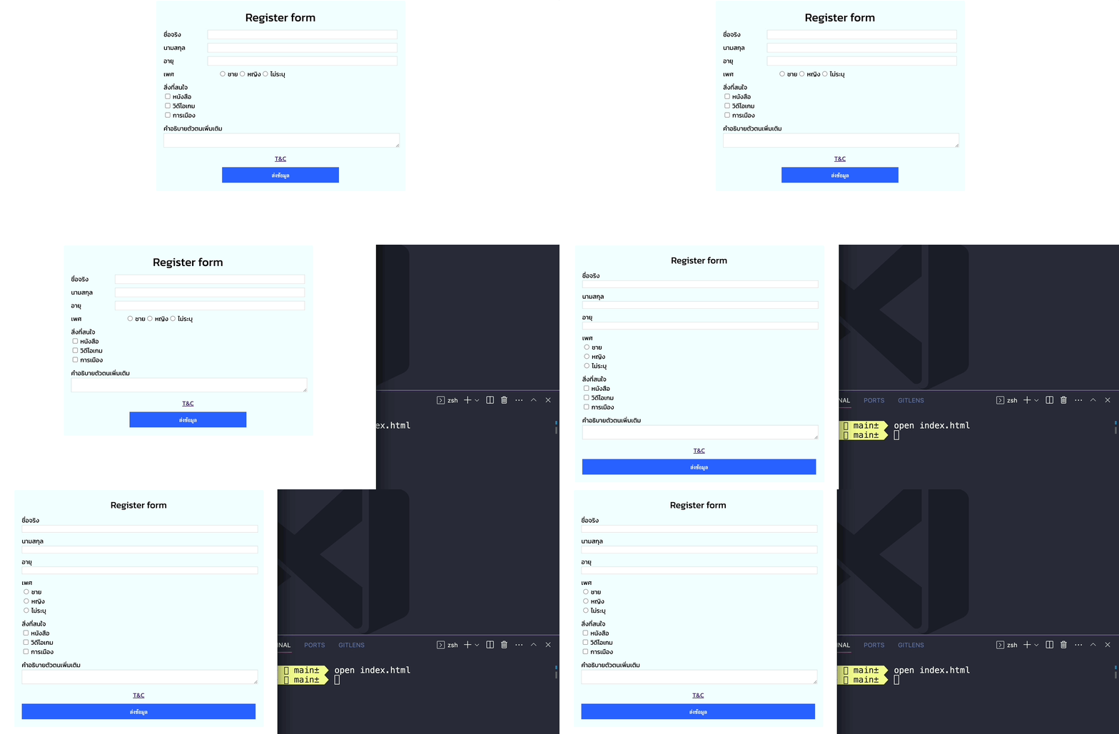
โจทย์ของการแต่ง style ให้เป็น responsive
- เปลี่ยนมาเป็น import style แทน
- ตอนย่อจอให้ input ตกมาอยู่ดัานล่างข้อความ
- radio เพศเรียงคนละบรรทัด
- desktop ปุ่มขนาดครึ่งหนึ่ง, mobile ตีเต็ม
- ลดขนาด Font หัวข้อลงตอน mobile
ที่ index.html ให้ย้ายไฟล์ css ออกไป
html
<!DOCTYPE html>
<html lang="en">
<head>
  <!-- ส่วนที่ไม่แสดงออกไปในหน้าจอของ Browser -->
  <meta charset="UTF-8">
  <meta name="viewport" content="width=device-width, initial-scale=1.0">
  <title>Document 2</title>
  <link rel="stylesheet" href="styles.css">
</head>
<body>
    <!-- เหมือนกับ chapter ก่อนหน้านี้ -->
</body>
ที่ styles.css
css
@font-face {
  font-family: 'kanit';
  src: url('./Kanit/Kanit-Regular.ttf');
}

body {
  font-family: 'kanit';
}

.container {
  width: 100%;
  max-width: 640px;
  margin-left: auto;
  margin-right: auto;
  background-color: azure;
  padding: 20px;
  box-sizing: border-box;
}

.header {
  font-size: 30px;
  text-align: center;
}

.header-form {
  width: 140px;
}

.flex {
  display: flex;
}

.form-input {
  margin-bottom: 10px;
}

.center {
  text-align: center;
}

input.form, textarea {
  border: 1px gainsboro solid;
  width: 100%;
}

.button {
  border: 0;
  width: 50%;
  height: 40px;
  background-color: #2962FF;
  color: white;
}

/* เพิ่ม code ส่วนนี้สำหรับการ handle ที่ขนาดหน้าจอเล็ก ให้แสดงผลออกมาตามโจทย์ */

@media screen and (max-width: 768px) {
  .flex {
    flex-direction: column;
  }

  .header {
    font-size: 24px;
  }

  .button {
    width: 100%;
  }
}
ผลลัพธ์
คำแนะนำตามประสบการณ์ ตอนที่แต่งเว็บไซต์
ปกติผมจะทำ CSS ตามลำดับคือ
- จัดการ layout (flex, grid) ให้ถูกต้องการ
- จัดการความสวยงาม เรื่อง color, spacing
- จัดการ Responsive ในแต่ละขนาดหน้าจอ
- Animation กับ ลูกเล่น เพิ่มเติม
Reference เพิ่มเติม https://web.dev/learn/design/