

รู้จักกับ Storybook และการทำ Component Specs
/ 15 min read
 สามารถดู video ของหัวข้อนี้ก่อนได้ ดู video
การทำ Component Specs
การทำ Component Specs ใน Frontend คือกระบวนการในการกำหนดและระบุคุณสมบัติและพฤติกรรมของ Component ในการพัฒนา software ซึ่งจะช่วยให้ทีมพัฒนาสามารถทำงานร่วมกันได้ตรงตามความต้องการ และช่วยให้ทราบถึงความสามารถและข้อจำกัดของแต่ละ Component ที่ถูกสร้างขึ้นมา
การทำ Component Specs สามารถแบ่งออกเป็นขั้นโดยประมาณคือ
- กำหนดคุณสมบัติ (Attribute) กำหนดคุณสมบัติของ Component ที่ต้องการพัฒนา เช่น ชื่อ Component, รูปแบบข้อมูล input, การแสดงผลที่คาดหวัง เป็นต้น
- ระบุพฤติกรรม (Behavior) ระบุพฤติกรรมของ Component ที่ต้องการพัฒนา เช่น การตอบสนองต่อ Event ต่าง ๆ, การปรับแต่งรูปแบบและการแสดงผล เป็นต้น
- ทดสอบและตรวจสอบ (Testing) ทดสอบ Component ที่พัฒนาขึ้นมาเพื่อตรวจสอบว่ามีความถูกต้องและประสิทธิภาพตามที่กำหนดหรือไม่
ซึ่งในหัวข้อนี้ เดี๋ยวเราจะมาดูตัวอย่างให้เห็นภาพการทำ Component Specs ผ่าน Storybook กัน
Storybook คืออะไร ?
Ref: https://storybook.js.org/
Storybook เป็นเครื่องมือที่ช่วยในการพัฒนาและทดสอบ Components ต่าง ๆ ใน Web application โดย Storybook จะช่วยให้เราสามารถสร้างและดูตัวอย่างของ Components แต่ละอันได้อย่างง่ายดาย
โดย Storybook มีข้อดีที่สำคัญคือ
- การรันการทดสอบ (run test) Storybook ช่วยให้เราสามารถทดสอบ Components ได้อย่างง่ายดาย และเพิ่มประสิทธิภาพในการตรวจสอบความถูกต้องของ Components ก่อนนำมาใช้งานจริงใน project ผ่านตัว UI ที่ Storybook เตรียมไว้
- ช่วยให้ Designer สามารถดู Components ได้ Storybook ช่วยให้เราสามารถแสดงตัวอย่างของ Components และทดสอบการแสดงผลของ Components ได้อย่างง่ายดาย ซึ่งช่วยให้ Designer สามารถตรวจสอบและปรับแต่งรูปแบบและการแสดงผลของ Components ได้ตรงตามความต้องการ
ดังนั้นการมี Storybook จะช่วยให้การพัฒนา project เป็นไปได้อย่างมีประสิทธิภาพ และช่วยให้ทั้ง developer และ design สามารถทำงานร่วมกันได้อย่างราบรื่นและมีความสุขมากยิ่งขึ้น (ตามหลักการแล้วอะนะ)
Storybook สามารถใช้ได้กับหลาย Frontend framework เจ้าดังๆอยู่แล้วอย่าง React, Vue, Angular, Svelte รวมถึงกับ Web Components ที่เป็น Standard ของ Browser เองด้วยเช่นกัน
มาเริ่มต้นลง Storybook เข้า project กันก่อน
Ref: https://storybook.js.org/docs/get-started/install
เพื่อให้ทุกคนเห็นภาพตรงกัน เราจะทำการลง project ของ React มาก่อนโดยใช้ Vite
npm create vite@latest my-storybook-app -- --template reactnpm installnpm run devเมื่อ run project ขึ้นมาได้เรียบร้อยให้ run คำสั่งสำหรับการ install storybook เข้า project ไป
npx storybook@latest initเมื่อทำการลงเรียบร้อยแล้ว ให้ลอง run คำสั่ง start storybook ขึ้นมา
npm run storybookหากได้หน้าตาประมาณนี้มาถือว่าลง Storybook แล้วเรียบร้อย
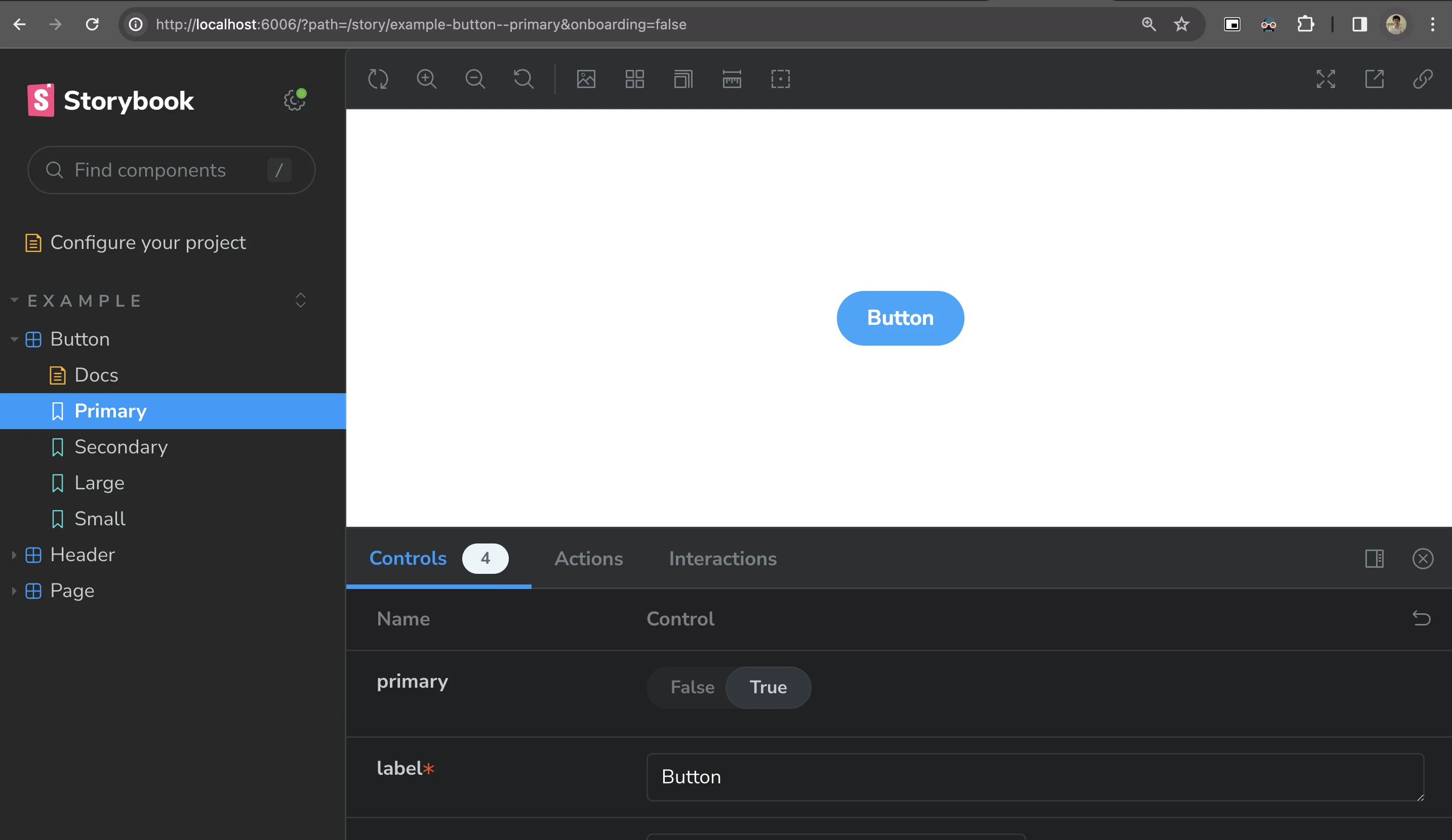
โดยสังเกตว่า ตอนที่ทำการ ลง storybook ขึ้นมา ตัว project จะมีไฟล์ .stories.js โผล่มาด้วย ออกมาเป็น folder ใหม่ที่ชื่อ stories ออกมา
.├── src│ └── stories│ ├── Button.jsx│ ├── Button.stories.js│ ├── Configure.mdx│ ├── Header.jsx│ ├── Header.stories.js│ ├── Page.jsx│ ├── Page.stories.js└── vite.config.jsเรามาดูตัวอย่างใน Header.stories.js กัน
import { Header } from "./Header";
export default { title: "Example/Header", component: Header, // This component will have an automatically generated Autodocs entry: https://storybook.js.org/docs/writing-docs/autodocs tags: ["autodocs"], parameters: { // More on how to position stories at: https://storybook.js.org/docs/configure/story-layout layout: "fullscreen", },};
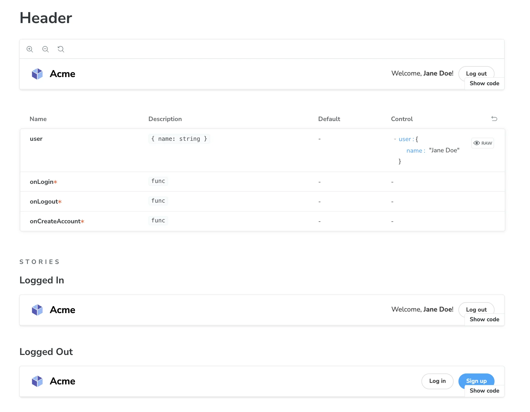
export const LoggedIn = { args: { user: { name: "Jane Doe", }, },};
export const LoggedOut = {};ในส่วนของ code ของ Storybook ด้านบนนั้น มีการกำหนดและระบุ Component Specs และการทดสอบโดยใช้ Storybook ดังนี้
- ตอนแรกเรากำหนดคุณสมบัติของ Component และระบุชื่อ Component และตำแหน่งของ Component ใน Storybook
title: 'Example/Header'กำหนดชื่อเรื่องของ Component และตำแหน่งที่ Component จะอยู่ใน Storybookcomponent: Headerระบุ Component ที่ต้องการแสดงใน Storybooktags: ['autodocs']กำหนด tag ของ Component เพื่อใช้ใน Autodocs (Autodocs คือตัวที่สามารถทำ Document ของ Component specs ออกมาได้อย่างอัตโนมัติผ่านการอ่าน Prop Attribute และ Story สามารถอ่านเรื่อง Autodocs เพิ่มเติมได้ ที่นี่)parameters: { layout: 'fullscreen' }กำหนดลักษณะและตำแหน่งของ Component ใน Storybook
- เราประกาศตัวแปร
LoggedInและLoggedOutซึ่งเป็นตัวอย่างของ parameters ของ Component ใน StorybookLoggedInเป็นตัวอย่างของการใช้งาน Component โดยมี parametersuserที่มีค่าเริ่มต้นเป็น{ name: 'Jane Doe' }LoggedOutเป็นตัวอย่างของการใช้งาน Component โดยไม่มี parameters
โดย LoggedIn และ LoggedOut นั้นคือสิ่งที่เรียกว่า Story ใน Storybook
Story ใน Storybook คือตัวอย่างที่ใช้ในการแสดงและทดสอบ Components ต่าง ๆ ใน Web application ซึ่งสามารถใช้งานได้ผ่าน Storybook UI ที่เตรียมไว้ให้ ใน Storybook เราสามารถสร้าง Story ของ Components ที่ต้องการแสดงและทดสอบได้ ซึ่งสามารถกำหนดค่าและสร้างตัวอย่างของ Components แต่ละอันในรูปแบบต่าง ๆ ได้ (มองง่ายๆว่าเป็นเหมือน Test case ของ Component แต่ละเคสที่เราเตรียมเป็นตัวอย่างให้เอาไว้ดูเป็นตัวอย่างได้)
และเมื่อลองมาดูตัวอย่างผ่าน Storybook UI ในหน้าเว็บ ก็จะเจอว่า มี 2 Story คือ LoggedIn และ LoggedOut ออกมาเหมือนกันกับที่กำหนดไว้ใน storybook ออกมาได้ โดยจะออกมาคู่กับ Component Specs ตัวนั้นๆที่ได้มีการสร้างเอาไว้
อย่างที่เห็นนี่คือการเขียน Component specs ออกมานั่นเอง (เป็นเหมือนกับการเขียน Frontend Component Testing กลายๆด้วยเหมือนกัน) เพื่อเป็นการระบุว่า Component ตัวไหน มีความสามารถในการรับค่าไหนไปบ้าง และ เมื่อตัวแปรต่างกันจะ action แบบไหนออกมาบ้าง
อันที่ทุกคนเห็นอยู่นี้คือตัวอย่างที่ Storybook เตรียมเอาไว้ให้ตอนเริ่มต้น storybook ออกมา เดี๋ยวเราจะลองมาเขียน Storybook กันเพิ่มเติมบ้าง
มาลองสร้าง Component และเล่น Story ไปพร้อมๆกัน
ตัวอย่างที่เราจะทำกัน เราจะลองมาเล่นตัวอย่างกับ 3 Component กัน รวมถึงจะลองเขียน component testing แบบง่ายๆลง Storybook ไปคู่กัน
ก่อนที่เราจะไปต่อ เราจะขอลง tailwind ใน project เพื่อเพิ่มเติมส่วนของ style เข้ามาโดยทำการลง tailwindcss เข้าไปใน project ตาม document ของ tailwind ได้เลย (อ่านเพิ่มเติมการลง tailwind ด้วย vite ได้ ที่นี่)
โดยทำการลงผ่านคำสั่งนี้
npm install -D tailwindcss postcss autoprefixernpx tailwindcss init -pปรับ tailwind.config.js ที่เพิ่มเข้ามาใน project
/** @type {import('tailwindcss').Config} */export default { content: [ "./index.html", "./src/**/*.{js,ts,jsx,tsx}", ], theme: { extend: {}, }, plugins: [],}หลังจากนั้นเพิ่ม tailwind.css เข้ามา
@tailwind base;@tailwind components;@tailwind utilities;และทำการ import เข้าผ่าน main.jsx
import React from "react";import ReactDOM from "react-dom/client";import App from "./App.jsx";
import "./index.css";import "./tailwind.css"; // เพิ่มบรรทัดนี้เข้ามา
ReactDOM.createRoot(document.getElementById("root")).render(  <React.StrictMode>    <App />  </React.StrictMode>,);
เป็นอันเสร็จสิ้นการติดตั้ง tailwind ให้ project แล้ว (สามารถตรวจสอบได้โดยการลองใช้ style tailwind ผ่าน document ของ tailwind ได้) หลังจากนั้นให้ทำการลงผ่าน storybook ต่อ (เพื่อให้ storybook สามารถใช้ style ของ tailwind ได้เช่นเดียวกัน สามารถอ่านข้อมูลการลงของ document storybook ได้ ที่นี่)
ขั้นแรก ทำการลง storybook addon ของตัว styling webpack เข้าไป
npx storybook@latest add @storybook/addon-styling-webpackเมื่อลงเสร็จที่ .storybook/preview.js ให้ทำการเรียกใช้ style ของ tailwind แบบ global ใน storybook
/** @type { import('@storybook/react').Preview } */import "../src/tailwind.css";
const preview = {  parameters: {    actions: { argTypesRegex: "^on[A-Z].*" },    controls: {      matchers: {        color: /(background|color)$/i,        date: /Date$/i,      },    },  },};
export default preview;
เมื่อเรียบร้อยก็จะเป็นอันเสร็จสิ้นการลง tailwind ทั้งจากหน้าเว็บและ storybook (เดี๋ยวมาตรวจสอบกันเพิ่มเติมจากการลองใส่ style ผ่าน Component กัน)
ในตัวอย่างนี้ เราจะทำการลองทำ Component มาทั้งหมด 3 ตัวคือ
- Modal Component สำหรับ popup (modal) โดยสามารถใส่ child component (component content ตรงกลางของ popup)
-
Carousel Component สำหรับการใส่รูปภาพ และสามารถเลื่อนรูปภาพไปมาได้ รวมถึงมี feature autoplay ที่สามารถ auto เลื่อนภาพใน carousal ได้

-
Register Form Component Form สำหรับการใส่ข้อมูล Name, Email และ Phone number สำหรับ register ข้อมูลเข้ามา (Component นี้เป็นตัวอย่างเดียวกับในหัวข้อ Frontend Testing สามารถอ่านเพิ่มเติมได้ ที่นี่ โดยในหัวข้อนี้เราจะพามา mock api ผ่าน Mock Service Worker กัน)
เราจะมาลองทำกันทีละ Component และมาลองทำ Storybook แต่ละ Component กัน
1. Modal Component
มาที่ Component แรก Modal Component โดย Feature ที่เราจะทำที่ Modal Component คือ
- Modal ต้องควบคุมการแสดงผลออกมาได้ (มีตัวแปรควบคุมการแสดงผลว่า แสดงผลออกมาได้หรือไม่)
- ต้องสามารถใส่ Content html อะไรไปใน Component ก็ได้ (เนื่องจาก Modal นั้นต้องมีความเป็น General ใช้ได้กับข้อมูลทุกประเภท)
- และต้องสามารถใส่ function อะไรก็ได้ที่จะจัดการเมื่อมีการปิด Modal (ในกรณีที่อาจจะต้องมีการ reset ค่าบางอย่าง จะได้ทำการ run function ก่อนที่ Modal จะปิดลง)
ที่ Modal.jsx code Component หน้าตาแบบนี้
import PropTypes from "prop-types";import "./modal.css";
const Modal = ({ isOpen, children, onClose }) => { if (!isOpen) { return null; }
return ( <div className="modal-overlay" onClick={onClose}> <div className="modal-content" onClick={(e) => e.stopPropagation()}> {children} <button className="close-button" aria-label="Close" onClick={onClose}> <svg xmlns="http://www.w3.org/2000/svg" viewBox="0 0 384 512" width="24" height="24"> <path fill="currentColor" d="M342.6 150.6c12.5-12.5 12.5-32.8 0-45.3s-32.8-12.5-45.3 0L192 210.7 86.6 105.4c-12.5-12.5-32.8-12.5-45.3 0s-12.5 32.8 0 45.3L146.7 256 41.4 361.4c-12.5 12.5-12.5 32.8 0 45.3s32.8 12.5 45.3 0L192 301.3 297.4 406.6c12.5 12.5 32.8 12.5 45.3 0s12.5-32.8 0-45.3L237.3 256 342.6 150.6z" /> </svg> </button> </div> </div> );};
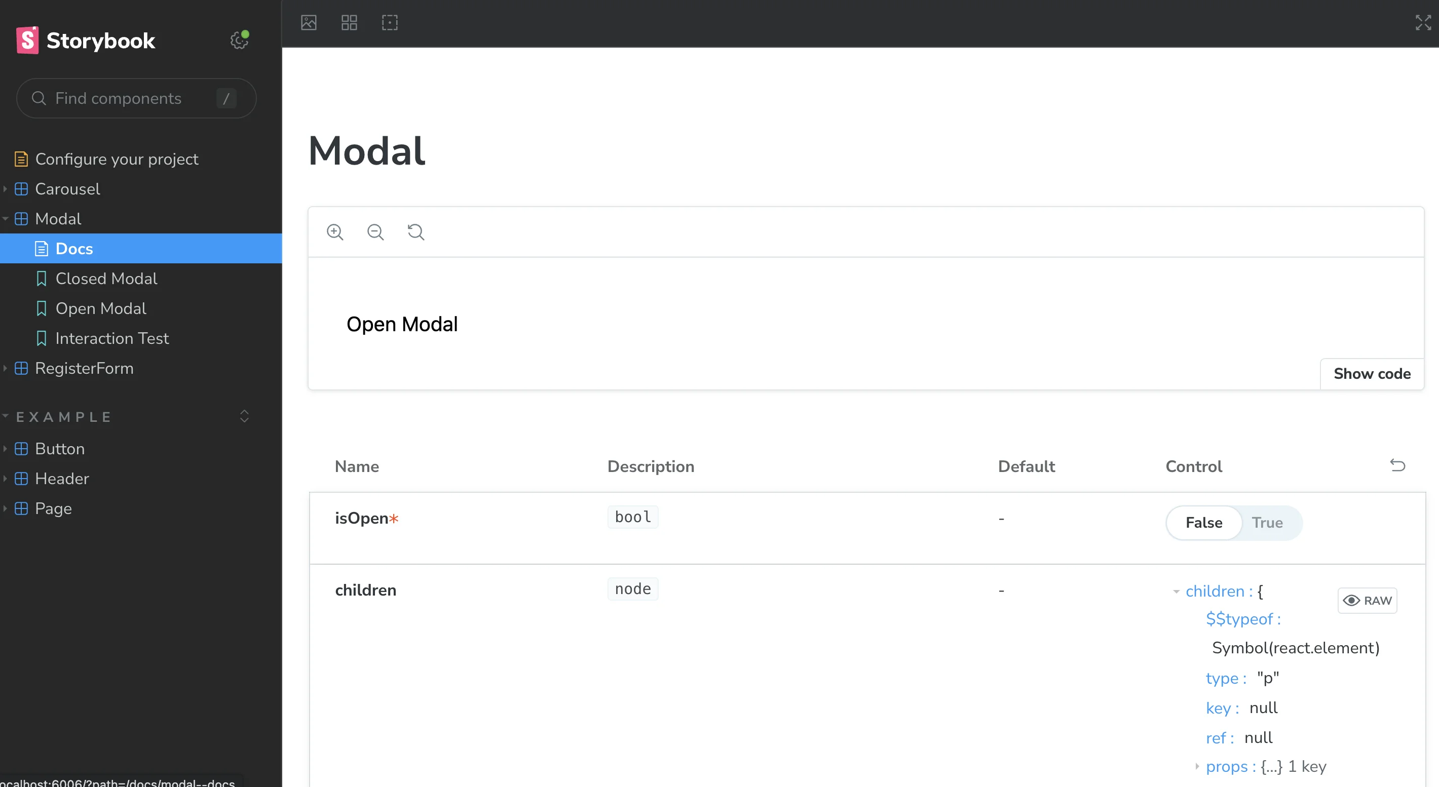
Modal.propTypes = { isOpen: PropTypes.bool.isRequired, children: PropTypes.node, onClose: PropTypes.func.isRequired,};
export default Modal;Code ด้านบนเป็นการสร้าง Component ที่เรียกว่า Modal โดยมีการทำงานดังนี้
- Component รับ parameters ที่มีคุณสมบัติดังนี้
isOpen(บอกว่า Modal อยู่ในสถานะเปิดหรือปิด),children(เนื้อหาภายใน Modal),onClose(function ที่จะถูกเรียกเมื่อปิด Modal) - หาก
isOpenเป็นfalseจะไม่แสดง Modal ออกมาเลย - หาก
isOpenเป็นtrueจะแสดง Modal ออกมา โดย<div className="modal-overlay">เป็นส่วนที่ครอบ Modal และให้คลิกที่ส่วนนี้เพื่อปิด Modal<div className="modal-content">เป็นส่วนที่เก็บเนื้อหาภายใน Modal และไม่ให้คลิกที่ส่วนนี้ปิด Modal{children}เป็นส่วนที่แสดงเนื้อหาภายใน Modal ซึ่งเป็น parameter ที่ส่งเข้ามา<button className="close-button">เป็นปุ่มสำหรับปิด Modal และเรียกใช้ functiononCloseเมื่อคลิก
และนี่คือ Modal Component ของเรา ทีนี้หากเราลองมาคิดเป็น Story ของ Component นี้ก็จะมีเคสประมาณนี้ได้แก่
- Story สำหรับการให้ตัวอย่างเวลาเปิดและปิด การใช้ Modal (ผ่านตัวแปร
isOpen) - Story สำหรับการทดสอบว่า เปิด และ ปิดใช้งานได้ โดยการกดจริงผ่าน UI (ใช้ Test ผ่าน Interaction Test อ่านเพิ่มเติมได้ ที่นี่)
** อธิบายเพิ่มเติมเรื่อง Interaction Test
Interaction Test ใน Storybook เป็นการทดสอบการตอบสนองของ Component ผ่านการจำลองการกระทำของผู้ใช้งาน (user interaction) ซึ่งเป็นการทดสอบว่า Component ทำงานได้ถูกต้องตามที่คาดหวังหรือไม่ โดยใช้ตัวอย่าง Storybook UI ที่เตรียมไว้ให้
เราสามารถใช้ Storybook UI ในการจำลองการกระทำของผู้ใช้งานเช่น การคลิก, การเลื่อน, การพิมพ์ข้อความ เป็นต้น และตรวจสอบผลลัพธ์ที่คาดหวังว่าถูกต้องหรือไม่ เช่นการตรวจสอบว่า Component ตอบสนองถูกต้องตามการกระทำของผู้ใช้งานหรือไม่ การตรวจสอบการเปิดหรือปิด Modal (เช่นเคสนี้) หรือการเปลี่ยนแปลงค่าในฟอร์ม เป็นต้น
การทำ Interaction Test ใน Storybook เป็นอีกวิธีหนึ่งที่ช่วยให้สามารถทดสอบการทำงานของ Component ได้อย่างรวดเร็ว โดยไม่ต้องเขียนโค้ดทดสอบด้วยตัวเอง (เหมาะเอาไว้ทำทั้ง Test case และให้ Designer ดู action ที่เกิดขึ้นจริงด้วย)
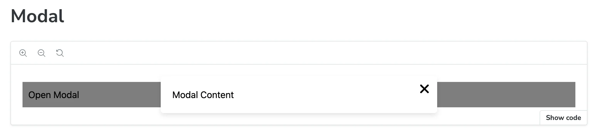
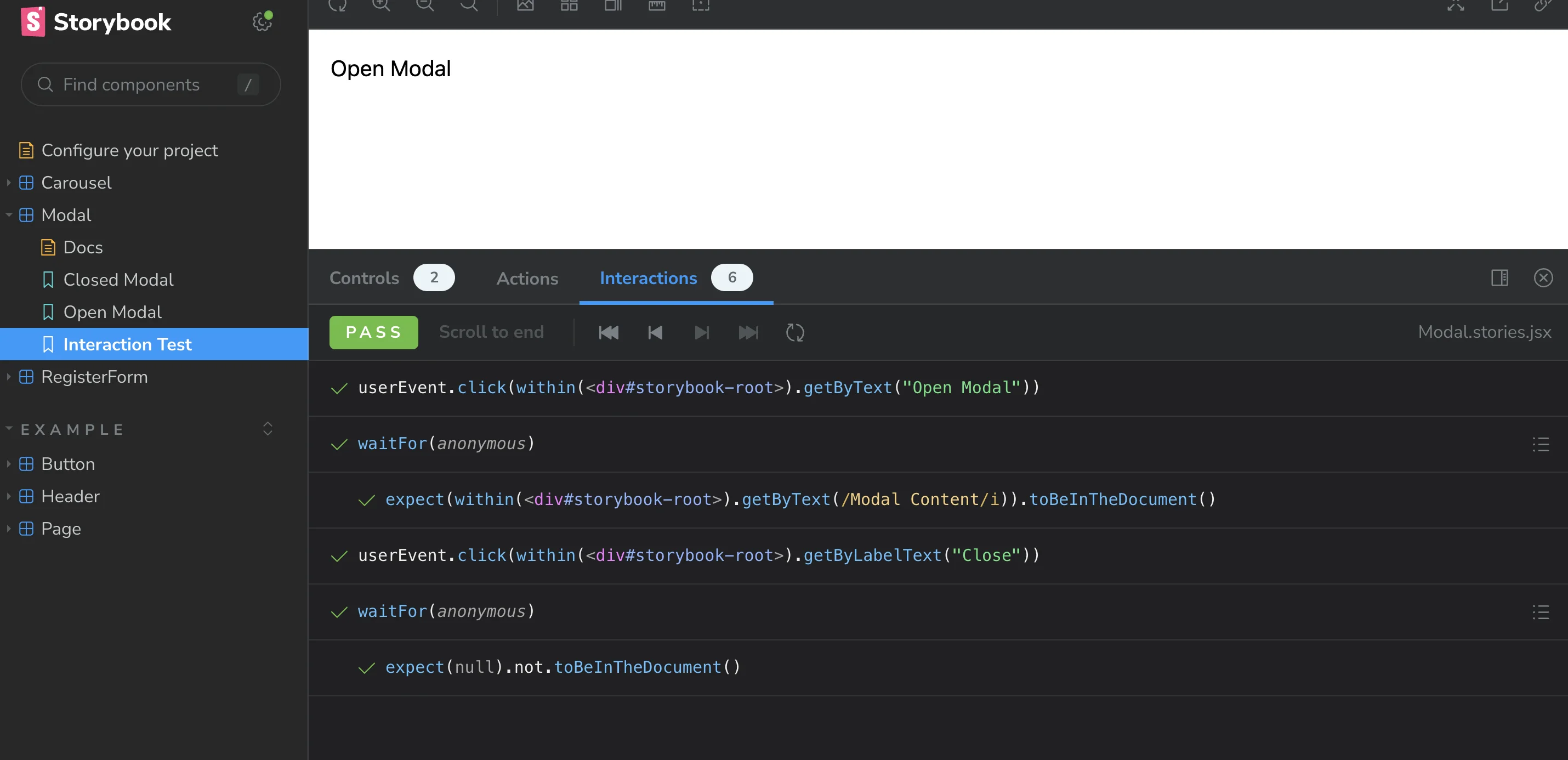
โดยเมื่อนำ Story ด้านบนมาเขียน storybook ที่ Modal.stories.jsx ก็จะได้หน้าตาประมาณนี้ออกมา
import { useState } from "react";import Modal from "./Modal";import { userEvent, within, waitFor, expect } from "@storybook/test";
export default {  title: "Modal",  component: Modal,  tags: ["autodocs"],  render: function Render(args) {    const [isOpen, setIsOpen] = useState(args.isOpen);    return (      <div>        <button onClick={() => setIsOpen(true)}>Open Modal</button>        <Modal {...args} isOpen={isOpen} onClose={() => setIsOpen(false)} />      </div>    );  },};
export const ClosedModal = {  args: {    isOpen: false,    children: <p>Modal Content</p>,  },};
export const OpenModal = {  args: {    isOpen: true,    children: <p>Modal Content</p>,  },};
export const InteractionTest = {  args: {    isOpen: false,    children: <p>Modal Content</p>,  },  play: async ({ canvasElement }) => {    const canvas = within(canvasElement);    const openButton = canvas.getByText("Open Modal");    userEvent.click(openButton);
    await waitFor(() => {      expect(canvas.getByText(/Modal Content/i)).toBeInTheDocument();    });
    const closeButton = canvas.getByLabelText("Close");    userEvent.click(closeButton);
    await waitFor(() => {      expect(canvas.queryByText(/Modal Content/i)).not.toBeInTheDocument();    });  },};
และเพิ่ม modal.css เข้ามาเพื่อสร้าง style ของ modal component ออกมา
.modal-overlay {  position: fixed;  top: 0;  left: 0;  width: 100%;  height: 100%;  background-color: rgba(0, 0, 0, 0.5);  display: flex;  justify-content: center;  align-items: center;  z-index: 1000;}
.modal-content {  background-color: white;  padding: 20px;  border-radius: 5px;  min-width: 50%;  max-width: 100%;  box-shadow: 0 4px 8px rgba(0, 0, 0, 0.1);  position: relative;}
.close-button {  position: absolute;  top: 10px;  right: 10px;  border: none;  background: none;  font-size: 20px;  cursor: pointer;}
อธิบายจาก code storybook modal ด้านบน
- ในการเริ่มต้น Storybook สำหรับ Modal Component นั้น เราจะต้องทำการ import ทุกอย่างที่เกี่ยวข้องเข้ามา เช่น
useStateและModalComponent ที่เราสร้างไว้ - เราจะสร้างตัวแปร
isOpenและsetIsOpenด้วยuseStateเพื่อเก็บสถานะการเปิดหรือปิดของ Modal ไว้ภายในrenderของ Component (renderเปรียบเสมือนการเรียกใช้งาน component ของ Modal และ โดยเราจะใช้ args เป็นตัวแทนในการสื่อสารผ่าน State ออกมาแทน เพื่อให้ state สามารถเปลี่ยนแปลงขณะ run storybook ออกมาได้)
โดยอย่างที่เห็นใน code ด้านบน เรามีการ Export story ออกมาทั้งหมด 3 Story คือ
- ClosedModal ใน story นี้เรากำหนดให้
isOpenเป็นfalseซึ่งจะทำให้ Modal ไม่แสดงออกมา และกำหนดเนื้อหาภายใน Modal ให้เป็น<p>Modal Content</p> - OpenModal ใน story นี้เรากำหนดให้
isOpenเป็นtrueซึ่งจะทำให้ Modal แสดงออกมา และกำหนดเนื้อหาภายใน Modal ให้เป็น<p>Modal Content</p> - InteractionTest ใน story นี้เราจะทดสอบการกระทำของผู้ใช้งานกับ Modal ผ่าน Storybook UI เช่นการคลิกที่ปุ่มเพื่อเปิด Modal และการคลิกที่ปุ่มเพื่อปิด Modal ซึ่งเราใช้
@storybook/testing-libraryและ@storybook/jestเพื่อใช้ในการเขียน Test และตรวจสอบผลลัพธ์ที่คาดหวัง และทำการส่งข้อมูลผ่านคำสั่งplayเพื่อเป็นการจำลองการ run Interactive Test ออกมา
เมื่อดูผลลัพธ์ผ่าน Storybook ก็จะเจอ tab ของ Modal ออกมาพร้อมทั้ง 3 Story ออกมาได้ (ภาพด้านล่างนี้คือตัวอย่างของ Interaction Test จะมี tab Interaction ที่จำลองการเล่นออกมาได้)
โดย เมื่อมีการเพิ่ม autodocs เข้ามา ก็จะมีหัวข้อ Docs ออกมา ที่จะทำการ Auto generate เอกสารของ Component Specs ออกมาได้ (โดยจะอ้างอิงตาม PropTypes ที่มีการประกาศไว้ใน Component) ซึ่งเป็นตัวอำนวยความสะดวกในการทำเอกสาร Component มากๆ (ให้อารมณ์เหมือน Auto gen Swagger ใน Backend)
2. Carousel Component
มาที่ Component ที่สอง Carousel Component โดย Feature ที่เราจะทำที่ Carousel Component คือ
- Carousel ต้องสามารถรับภาพหลายภาพเข้าไปได้
- Carousel ต้องสามารถควบคุมการเลื่อนของภาพไปมาได้ (เลื่อนไป / เลื่อนกลับได้)
- Carousel ต้องสามารถเล่น autoplay (เปลี่ยนภาพแบบอัตโนมัติ) ตามจำนวน miliseconds ที่ใส่ไปได้ (สามารถเลือกได้ว่าจะเปิดหรือปิด feature นี้ได้)
- Carousel สามารถกำหนดภาพเริ่มต้นได้ว่าจะเริ่มต้นจากภาพไหน
ที่ Carousel.jsx code Component ก็จะหน้าตาประมาณนี้
import { useState, useEffect } from "react";import PropTypes from "prop-types";
const Carousel = ({ images, startIndex, autoplay, interval }) => {  const [currentIndex, setCurrentIndex] = useState(startIndex);
  // Function to go to the next image  const nextImage = () => {    setCurrentIndex((prevIndex) => (prevIndex === images.length - 1 ? 0 : prevIndex + 1));  };
  // Function to go to the previous image  const prevImage = () => {    setCurrentIndex((prevIndex) => (prevIndex === 0 ? images.length - 1 : prevIndex - 1));  };
  // Autoplay effect  useEffect(() => {    if (autoplay) {      const timer = setInterval(() => {        nextImage();      }, interval);      return () => clearInterval(timer);    }  }, [currentIndex, autoplay, interval]);
  return (    <div className="flex w-full flex-col items-center justify-center">      <div className="relative w-full max-w-4xl">        {images && images.length > 0 && (          <img            src={images[currentIndex]}            alt={`Slide ${currentIndex}`}            className="h-auto w-full rounded-lg object-cover shadow-lg"          />        )}
        <button          onClick={prevImage}          className="absolute left-0 top-1/2 -translate-y-1/2 transform rounded-full bg-white bg-opacity-50 p-2 text-black shadow hover:bg-opacity-75"        >          Previous        </button>        <button          onClick={nextImage}          className="absolute right-0 top-1/2 -translate-y-1/2 transform rounded-full bg-white bg-opacity-50 p-2 text-black shadow hover:bg-opacity-75"        >          Next        </button>      </div>    </div>  );};
Carousel.propTypes = {  // images should be an array of strings (URLs) and is required  images: PropTypes.arrayOf(PropTypes.string).isRequired,  // startIndex should be a number and optional  startIndex: PropTypes.number,  // autoplay should be a boolean and optional  autoplay: PropTypes.bool,  // interval should be a number and optional  interval: PropTypes.number,};
Carousel.defaultProps = {  startIndex: 0,  autoplay: true,  interval: 3000,};
export default Carousel;
ใน code ของ Carousel Component นี้ เรามีการใช้ Hook ของ React อย่าง useState และ useEffect เพื่อใช้ในการจัดการสถานะและเอฟเฟกต์ของ Carousel นั้น ๆ
useStateใช้ในการเก็บค่า currentIndex ซึ่งจะบอกลำดับของภาพปัจจุบันที่กำลังแสดงอยู่ใน CarouseluseEffectใช้ในการทำ Autoplay ของ Carousel หาก autoplay เป็นtrueจะทำการเปลี่ยนภาพอัตโนมัติตาม interval ที่กำหนด- Component จะแสดงผลออกมาเป็นรูปภาพที่อยู่ใน
imagesตามลำดับของcurrentIndexที่กำหนด และมีปุ่ม “Previous” และ “Next” สำหรับเลื่อนภาพไปข้างหน้าและข้างหลัง - ในการใช้งาน Carousel Component นี้ เราสามารถส่ง props ต่าง ๆ เพื่อกำหนดค่าต่าง ๆ ได้ เช่น
images(รูปภาพที่จะแสดงใน Carousel) ซึ่งควรเป็น Array ของ URLs และเป็นค่าที่ต้องส่งเข้ามาเสมอ ในส่วนของstartIndex,autoplay, และintervalเป็นค่า default ที่กำหนดไว้ แต่สามารถแก้ไขได้ตามต้องการ startIndexใช้สำหรับการกำหนด index เริ่มต้นของภาพautoplayใช้สำหรับกำหนดว่าเกิดใช้งานเล่นอัตโนมัติหรือไม่ และintervalกำหนดว่าหากเล่นอัตโนมัติจะทำการเปลี่ยนภาพทุกๆกี่ miliseconds
และนี่คือ Carousel Component ของเรา ทีนี้หากเราลองมาคิดเป็น Story ของ Component นี้ เราก็สามารถล้อตามเคสของ Feature ใน Carousel (4 ข้อ) ที่เรา list ด้านบนได้เลย เมื่อนำมาเขียน Storybook ที่ Carousel.stories.jsx ก็จะมีหน้าตาประมาณนี้
import Carousel from "./Carousel";import { within, userEvent, waitFor, expect } from "@storybook/test";
export default { title: "Carousel", component: Carousel, tags: ["autodocs"], args: { images: [ "https://fastly.picsum.photos/id/648/300/200.jpg?hmac=1CBWajz31GOLUdds_HpCDPaHDG6FF3eoY1fYcoFgEMY", "https://fastly.picsum.photos/id/69/300/200.jpg?hmac=eLc6u_j4wqI6rURIhekE0kS1oYHTmD7tNZ1LeEPyIeY", "https://fastly.picsum.photos/id/625/300/200.jpg?hmac=2JeYxbeay5cJXc4_CqXxaSVY6atO8yOJOZ9emIGYDf4", ], },};
export const Basic = { args: { autoplay: false, },};
export const Autoplay = { args: { autoplay: true, interval: 1000, },};
export const CustomStartIndex = { args: { startIndex: 1, autoplay: false, },};
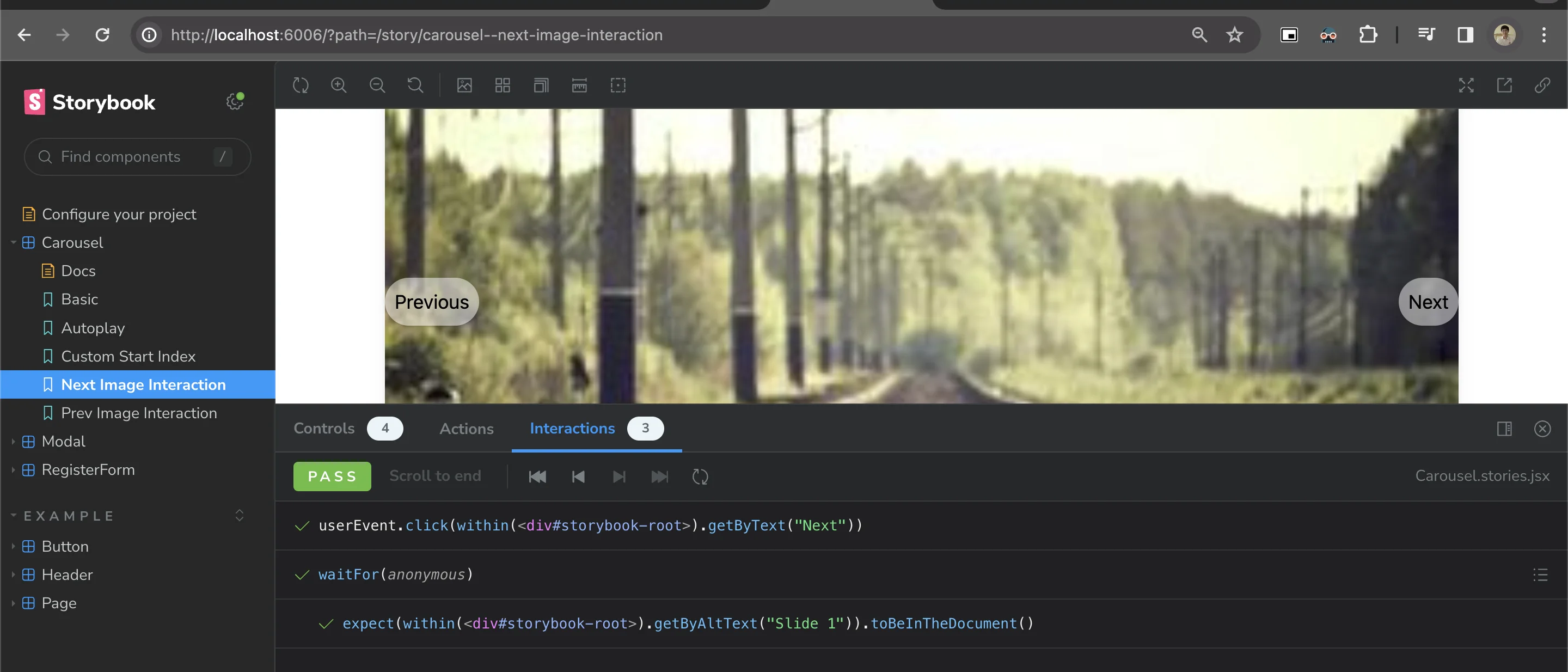
export const NextImageInteraction = { args: { autoplay: false, }, play: async ({ canvasElement }) => { const canvas = within(canvasElement); const nextButton = canvas.getByText("Next"); await userEvent.click(nextButton);
await waitFor(async () => { await expect(canvas.getByAltText("Slide 1")).toBeInTheDocument(); }); },};
export const PrevImageInteraction = { args: { autoplay: false, startIndex: 1, }, play: async ({ canvasElement }) => { const canvas = within(canvasElement); const prevButton = canvas.getByText("Previous"); await userEvent.click(prevButton);
await waitFor(async () => { // Replace this with the actual logic to verify the image change await expect(canvas.getByAltText("Slide 0")).toBeInTheDocument(); }); },};ใน code ของ Storybook Carousel Component นี้ เรามีการสร้าง Story ทั้งหมด 5 Stories คือ
- Basic ใน Story นี้เรากำหนด
autoplayเป็นfalseซึ่งจะไม่เปิดใช้งาน Autoplay feature และไม่กำหนดค่าintervalใด ๆ (เพื่อให้เห็น Component แบบทั่วๆไปออกมาก่อน) - Autoplay ใน Story นี้เรากำหนด
autoplayเป็นtrueซึ่งจะเปิดใช้งาน Autoplay feature และกำหนดค่าintervalเป็น1000milliseconds (1 วินาที) - CustomStartIndex ใน Story นี้เรากำหนด
startIndexเป็น1ซึ่งจะกำหนดให้ภาพเริ่มต้นแสดงเป็นภาพลำดับที่ 1 จากimagesที่กำหนด - NextImageInteraction ใน Story นี้ (เป็น Interaction Test) เราจะทดสอบการกระทำของผู้ใช้งานกับ Carousel โดยการคลิกที่ปุ่ม “Next” เพื่อเลื่อนภาพไปข้างหน้า และตรวจสอบผลลัพธ์ว่าภาพถัดไปแสดงตรงตามที่คาดหวังหรือไม่
- PrevImageInteraction ใน Story นี้ (เป็น Interaction Test) เราจะทดสอบการกระทำของผู้ใช้งานกับ Carousel โดยการคลิกที่ปุ่ม “Previous” เพื่อเลื่อนภาพย้อนกลับ และตรวจสอบผลลัพธ์ว่าภาพก่อนหน้าแสดงตรงตามที่คาดหวังหรือไม่
และนี่คือตัวอย่าง Storybook ของ Carousel (ก็จะมีเคสตามที่เขียนเอาไว้)
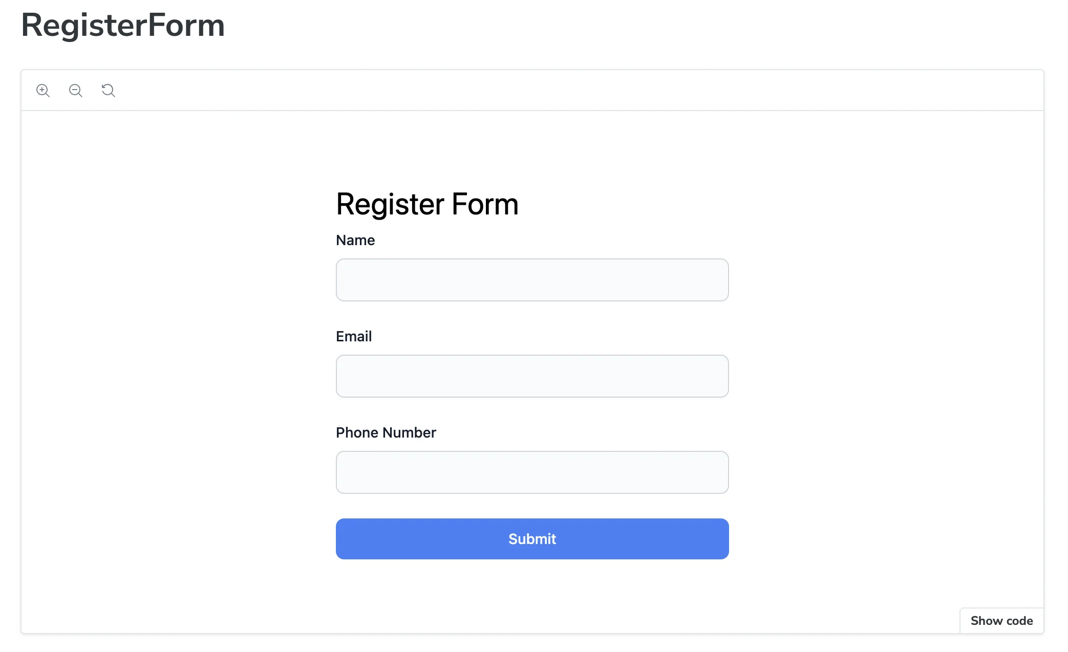
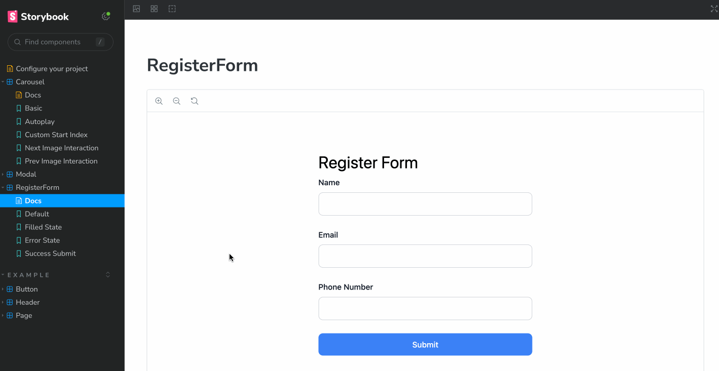
3. Register Form Component
มาที่ Component สุดท้ายของ Carousel Component โดย Feature ที่เราจะทำที่ Register Form Component โดยสิ่งที่เราจะมีใน Component นี้คือ
- มี Form ทั้งหมด 3 fields คือ
name(กรอกชื่อ),email(กรอกอีเมล) และphoneNumber(กรอกเบอร์โทรศัพท์) - ในส่วนของ
emailและphoneNumberนั้นมีการ validate ด้วยว่าถูก format หรือไม่ หากกรอกไม่ถูกต้องต้องแสดง Error ออกมาได้ - หากกรอกทุกอย่างถูกต้อง และ Submit ข้อมูล ทำการนำข้อมูลทั้ง 3 อย่างส่งผ่าน API เพื่อนำไปบันทึกข้อมูลต่อได้
จากโจทย์นี้ที่ Register.jsx code Component ก็จะหน้าตาประมาณนี้
import { useState } from "react";import axios from "axios";
export default function RegisterForm() {  const [formData, setFormData] = useState({    name: "",    email: "",    phoneNumber: "",  });  const [errors, setErrors] = useState({});
  const validate = (values) => {    let errors = {};    if (!values.name) {      errors.name = "Name is required";    }    if (!values.email) {      errors.email = "Email is required";    } else if (!/\S+@\S+\.\S+/.test(values.email)) {      errors.email = "Email is invalid";    }    if (!values.phoneNumber) {      errors.phoneNumber = "Phone number is required";    } else if (!/^\d{10}$/.test(values.phoneNumber)) {      errors.phoneNumber = "Invalid phone number, should be 10 digits";    }    return errors;  };
  const handleChange = (event) => {    const { name, value } = event.target;    setFormData({      ...formData,      [name]: value,    });  };
  const handleSubmit = async (event) => {    event.preventDefault();    const newErrors = validate(formData);    if (Object.keys(newErrors).length === 0) {      try {        const response = await axios.post(          "https://65a25d5342ecd7d7f0a771bd.mockapi.io/users",          formData,        );        if (!response.data) throw new Error("Error in form submission");        // Handle success here        alert("Register successful!");      } catch (error) {        // Handle errors here        console.log("error", error);        alert("Register fail!");      }    } else {      setErrors(newErrors);    }  };
  return (    <>      <form onSubmit={handleSubmit} className="mx-auto my-8 max-w-sm">        <h1 className="mb-2 text-3xl">Register Form</h1>        <div className="mb-6">          <label htmlFor="name" className="mb-2 block text-sm font-medium text-gray-900">            Name          </label>          <input            type="text"            id="name"            name="name"            onChange={handleChange}            value={formData.name}            data-testid="name"            className="block w-full rounded-lg border border-gray-300 bg-gray-50 p-2.5 text-sm text-gray-900 focus:border-blue-500 focus:ring-blue-500"          />          {errors.name && <p className="text-xs text-red-500">{errors.name}</p>}        </div>        <div className="mb-6">          <label htmlFor="email" className="mb-2 block text-sm font-medium text-gray-900">            Email          </label>          <input            type="text"            id="email"            name="email"            onChange={handleChange}            value={formData.email}            data-testid="email"            className="block w-full rounded-lg border border-gray-300 bg-gray-50 p-2.5 text-sm text-gray-900 focus:border-blue-500 focus:ring-blue-500"          />          {errors.email && <p className="text-xs text-red-500">{errors.email}</p>}        </div>        <div className="mb-6">          <label htmlFor="phoneNumber" className="mb-2 block text-sm font-medium text-gray-900">            Phone Number          </label>          <input            type="text"            id="phoneNumber"            name="phoneNumber"            onChange={handleChange}            value={formData.phoneNumber}            data-testid="phoneNumber"            className="block w-full rounded-lg border border-gray-300 bg-gray-50 p-2.5 text-sm text-gray-900 focus:border-blue-500 focus:ring-blue-500"          />          {errors.phoneNumber && <p className="text-xs text-red-500">{errors.phoneNumber}</p>}        </div>
        {/* Submit button */}        <button          type="submit"          className="w-full rounded-lg bg-blue-500 px-5 py-2.5 text-center text-sm font-medium text-white hover:bg-blue-700 focus:ring-4 focus:ring-blue-300"        >          Submit        </button>      </form>    </>  );}
ใน code ของ RegisterForm Component นี้
- เราใช้ Hook ของ React คือ
useStateเพื่อใช้ในการจัดการสถานะของฟอร์ม และใช้ axios library ในการทำ HTTP request สำหรับส่งข้อมูลผ่าน API - ในส่วนของ validate function เราใช้เพื่อตรวจสอบความถูกต้องของข้อมูลที่ผู้ใช้กรอกเข้ามา โดยตรวจสอบว่า
name,email, และphoneNumberไม่เป็นค่าว่าง และตรวจสอบรูปแบบของemailว่าถูกต้องหรือไม่ (ใช้ regular expression) และตรวจสอบรูปแบบของphoneNumberว่าเป็นตัวเลข 10 หลักหรือไม่ - ในส่วนของ handleChange function เราใช้เพื่ออัปเดตข้อมูลในฟอร์มเมื่อผู้ใช้กรอกข้อมูลหรือเลือกตัวเลือกบนฟอร์ม
- ในส่วนของ handleSubmit function เราใช้เพื่อจัดการเหตุการณ์เมื่อผู้ใช้กด Submit โดยเราจะทำการ validate ข้อมูลในฟอร์ม หากไม่มีข้อผิดพลาดจะทำการส่งข้อมูลผ่าน API และแสดงข้อความเมื่อสำเร็จหรือไม่สำเร็จ
ทีนี้ Component นี้แตกต่างกับ UI Component 2 ตัวก่อนหน้าคือ เป็น Component ที่ทำงานเฉพาะออกมา (คือไม่ใช่ Component ที่ถูกสร้างมาเพื่อ Recycle เป็น UI Component แต่ถูกสร้างขึ้นมาเพื่อใช้สำหรับหน้านั้นๆโดยเฉพาะ รวมถึงมีการส่งข้อมูลผ่าน API ด้วย)
ดังนั้นจึงจำเป็นต้องมีการเพิ่มสิ่งหนึ่งเข้ามาเพื่อให้สามารถ Mock การส่ง API ได้ (เพื่อทำ Interaction Test) ซึ่งจริงๆ จะใช้วิธีเดียวกันกับในหัวข้อ Frontend Testing ก็ได้ (อย่างที่บอกไว้ด้านบน เป็น Component ตัวเดียวกันกับหัวข้อนั้น) แต่เราจะขอแนะนำตัวที่ใช้สำหรับการ Mock Server โดยเฉพาะอีกตัวหนึ่ง ที่มี addons ใช้กับ storybook ได้นั่นคือ Mock Service Worker
Mock Service Worker (MSW) เป็นเครื่องมือที่ช่วยในการจำลองและทดสอบการเรียกใช้งาน API ใน application ด้วย MSW เราสามารถสร้างและกำหนดการ Response เทียบเท่ากับเซิร์ฟเวอร์จริงได้ ซึ่งช่วยให้เราสามารถทดสอบการทำงานของ application ของเราได้โดยไม่ต้องพึ่งพาเซิร์ฟเวอร์จริง นอกจากนี้ยังมีความสามารถในการกำหนดเงื่อนไขการ Response ที่หลากหลาย เช่น การจำลองการตอบสนองแบบค้างคาว (throttling) หรือการตอบสนองแบบล่าช้า (delay) เพื่อทดสอบภาวะเสียงสูง นอกจากนี้ยังสามารถใช้งานร่วมกับ Storybook เพื่อจำลองและทดสอบการเรียกใช้งาน API ใน Storybook ได้อีกด้วย (อ่านเพิ่มเติมเรื่อง Mock Service Worker ได้ที่ https://mswjs.io/ ได้เลย)
โดยขั้นแรกทำการลง MSW (ตามเอกสารนี้)
npm i msw msw-storybook-addon -Dหลังจากนั้นทำการ Generate service worker สำหรับใช้งานคู่กับ MSW ออกมาที่ folder public
npx msw init public/เมื่อทำการลงทุกอย่างเสร็จให้ทำการเพิ่ม config ของ MSW เข้าไปได้ที่ .storybook/preview.js
/** @type { import('@storybook/react').Preview } */import "../src/tailwind.css";import { initialize, mswLoader } from "msw-storybook-addon";
// Initialize MSWinitialize();
const preview = {  parameters: {    /* เหมือนเดิม */  },  loaders: [mswLoader],};
export default preview;
เพียงเท่านี้ก็จะเป็นการลง MSW เข้า project แล้วเป็นที่เรียบร้อย ทีนี้ จาก Register Form Component เราจะทำการทดลองเขียน Story (แบบ Interaction Test ทั้ง 3 story) ออกมาได้แก่
- Story ทดสอบการลองกรอกข้อมูลให้ครบ (ดูว่า input สามารถใช้งานได้ปกติก่อนไหม)
- Story ทดสอบว่าหากกรอกข้อมูลไม่ถูกต้อง (ตัวอย่างนี้เราจะลองกับ email) ดูว่า Error แสดงออกมาถูกต้องหรือไม่
- Story ทดสอบการยิง submit ว่า เมื่อมีการกรอกข้อมูลครบและยิง submit ไปสามารถส่งข้อมูลได้ (โดยในเคสนี้เราจะทำการ Mock API เพื่อไม่ให้เกิดการส่งจริงตอนกด submit)
เมื่อนำมาเขียน Storybook ที่ Register.stories.jsx ก็จะได้หน้าตาประมาณนี้ออกมา
import Register from "./Register";import { within, userEvent, expect } from "@storybook/test";import { rest } from "msw";
export default { title: "RegisterForm", component: Register, tags: ["autodocs"], parameters: { msw: { handlers: [ rest.post("https://65a25d5342ecd7d7f0a771bd.mockapi.io/users", (req, res, ctx) => { return res(ctx.json({ message: "Register successful!" }), ctx.status(200)); }), ], }, },};
export const Default = {};
export const FilledState = { play: async ({ canvasElement }) => { const canvas = within(canvasElement); await userEvent.type(canvas.getByTestId("name"), "John Doe", { delay: 100 }); delay: 100, }); await userEvent.type(canvas.getByTestId("phoneNumber"), "1234567890", { delay: 100, }); },};
export const ErrorState = { play: async ({ canvasElement }) => { const canvas = within(canvasElement); await userEvent.type(canvas.getByTestId("email"), "invalid-email", { delay: 100, }); await userEvent.click(canvas.getByText("Submit"));
await expect(canvas.getByText("Email is invalid")).toBeInTheDocument(); await expect(canvas.getByText("Name is required")).toBeInTheDocument(); await expect(canvas.getByText("Phone number is required")).toBeInTheDocument(); },};
export const SuccessSubmit = { play: async ({ canvasElement }) => { const canvas = within(canvasElement); await userEvent.type(canvas.getByTestId("name"), "John Doe"); await userEvent.type(canvas.getByTestId("phoneNumber"), "1234567890");
userEvent.click(canvas.getByText("Submit")); },};ใน code ของ Storybook ของ Register Component นี้ เรามีการสร้าง Story ทั้งหมด 4 Stories คือ
- Default เป็น Story ที่ไม่มีการกระทำอะไรใดๆ แค่แสดง Component ออกมาเพื่อให้เห็นรูปแบบตัว Component
- FilledState เป็น Story ที่จะทดสอบการใส่ข้อมูลให้ครบทุก field ของ Form โดยการใส่ชื่อเป็น ‘John Doe’, อีเมลเป็น ‘[email protected]’, และหมายเลขโทรศัพท์เป็น ‘1234567890’
- ErrorState เป็น Story ที่จะทดสอบกรณีกรอกข้อมูลไม่ถูกต้อง โดยทดสอบกรณีกรอกอีเมลที่ไม่ถูกต้อง และไม่กรอกชื่อและหมายเลขโทรศัพท์
- SuccessSubmit เป็น Story ที่จะทดสอบกรณีการส่งข้อมูลเมื่อกรอกข้อมูลครบถ้วน โดยการกรอกข้อมูลและกด Submit ใน Story นี้เราใช้งาน Mock Service Worker (MSW) เพื่อจำลองและทดสอบการส่งข้อมูลผ่าน API ใน Storybook โดยการกำหนดการ Response สำหรับ API POST
https://<mock api>/usersที่ใช้ใน Storybook โดยกำหนดผ่าน handlers ใน parameters ของ msw เป็น global ของ Component นั้นเอาไว้ ทำให้สามารถเรียกใช้งาน mock API จากในทุก Story ของ Component นั้นได้ ทำให้ Story นี้สามารถ Submit Form ได้โดยไม่ส่งข้อมูลจริงเข้าไปได้
และนี่คือตัวอย่าง storybook ของ Register component (ตัวอย่างการเล่น Interaction Test ของ Success submit) สังเกตว่าจะขึ้น popup ว่าส่งข้อมูล Success มาได้ แต่ข้อมูลจะไม่ส่งไปยัง API จริงๆออกมาได้
สรุป
และนี่คือตัวอย่างการทำ Component Specs ผ่าน Storybook จะเห็นว่าเราสามารถสร้าง Component ไปพร้อมกับสร้าง Document specs พร้อมๆกันได้ด้วย library storybook โดยไม่จำเป็นต้องทำเอกสารอื่นๆเพิ่มเติม เพียงแค่ลง library และทำตาม specs ของ storybook เราก็จะได้ทั้ง code ที่สามารถนำมาทดสอบ Component ได้ และได้เอกสาร storybook ที่เป็นเอกสาร specs ออกมาได้เช่นเดียวกัน
สำหรับใครที่กำลังหาเครื่องมือสำหรับเขียนเอกสาร Frontend และ Component อยู่ ลองพิจารณา Storybook ให้เป็นอีกหนึ่งตัวที่ช่วยเสริมพลังของ Frontend กันดูนะครับ 😁
- OAuth คืออะไร ?มี Video
มารู้จักกับพื้นฐาน OAuth กันว่ามันคืออะไร และสิ่งที่เรากำลังทำกันอยู่คือ OAuth หรือไม่

- ลองเล่น Supabase กับ Next.js กันมี Video มี Github
รู้จักกับ Supabase เทคโนโลยีฐานข้อมูลที่เรียกตัวเองว่าเป็น Firebase alternative กันว่าใช้ทำอะไรได้บ้าง

- รู้จักกับ Auth0มี Video
มารู้จักกับ Auth0 Authentication platform ที่ช่วยทำให้พัฒนา application พร้อมระบบยืนยันตัวตนได้ง่ายขึ้น

- รู้จักกับ ORM ตัวช่วย query ฐานข้อมูลกันมี Video มี Github
พามาลองเล่นตัว ORM หรือ Object Relational Mapping เทคนิคสำหรับการคุยกับ Database ผ่าน Object กัน
